Related Topics
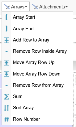
When configuring a form, controls can be placed into a dynamic list, known as an array. An array consists of Form controls placed in a single table row, with array boundary controls at the beginning and end of the table row. At run-time, users can dynamically add or remove rows from the array.
The Array Start and Array End controls are the two required boundary controls that determine where the array begins and ends. Every Array must contain both controls. In addition to the two mandatory controls, there are other controls that you might wish to use. Some of them must be placed inside an Array row, while others are placed outside of the Array.
- Add Row to Array: placed outside the Array.
- Remove Row Inside Array: must be placed inside an Array row.
- Move Array Row Up/Down: must be placed inside the Array row.
- Remove Row Button: placed outside the Array.
- Sum: placed outside the Array.
- Sort Array: placed outside the Array.
- Row Number: must be placed inside the Array row.
In a normal Form, you'll most commonly use just the Array Start/End, the Add Row to Array, and Sum controls.
 Array Start/End (Repeating Rows)
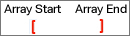
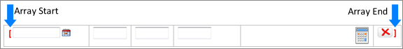
The array controls allow rows of items to be dynamically increased or decreased using an array tag. Using the array controls, you'll notice that red brackets mark the beginning and end of each array.
In general, Arrays are used in conjunction with table rows, with the Array Start control placed as the very first item in the first column of the table, and the Array End control placed as the very last item in the last column of the table. Each Array Start control requires a corresponding Array End control to close the array. All of the controls placed between the Array Start and Array End controls comprise the array row.
 Arrays can't be nested inside each other.
 An Array row can span more than one table row, as long as the Array End control is the last control in the last column cell of the table row.
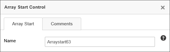
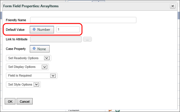
Double-clicking the Array Start control will open the Properties dialog box, in which you can configure the settings for the array.
An array has a Value property, which is the number of rows in the array. An array with a value of "2", therefore, will display two rows. The default value for an array is "0", which means that, as a default, an array won't display any rows when a Form first opens. It is common, however, to want the first row of the array to appear on the Form when it opens, which means that the default value of the array needs to be set to "1". Setting the value for an array is done in the Form Controls tab of the Form definition by configuring the field properties for the array. In the Form Field Properties dialog box for the array, set the Default Value property to a number with the value of "1".
Add/Remove Row Controls
You can allow the user to manually add or remove a row from an array by adding the Add Row to Array, Remove Row from Inside Array, and Remove Row from Array controls to your Form.
When placing these controls on the page, the Add Row to Array and Remove Row From Array controls should be placed outside of the array controls. Each of these controls has an Array Name property, into which you must enter the name of the array to which you wish to add or remove rows.
Both controls will add/remove a single row at the last row of the array by default. This default behavior can be changed. The At property enables you to specify the array row number where the add/remove operation will take place. Similarly, the Rows property enables you to specify the number of rows to add/remove.
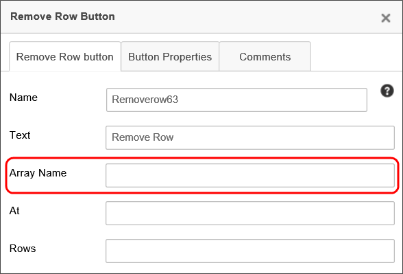
The Remove Row from Inside Array control should be placed inside the array controls, so that it will appear on each row of the array. When a user clicks this control, the row corresponding to the button will be removed from the array, unlike the Remove Row From Array control, which always removes the last (or specified) row from the array.
Move Row Up/Down
The Move Rows controls should be placed inside the array controls so that you can use them to move the row up or down in the array.
Sum
The Sum control displays the sum of all of the values in a column of the array.

To configure a sum control, open up the properties window by double clicking on the control inside the Form builder.
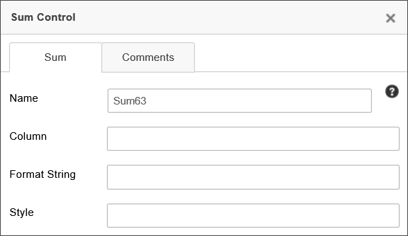
In the Column field, enter the name of the control in the column you'd like to sum.
Sort Array
The Sort Array control gives the user a button to sort the array alphabetically. The array can be sorted by three columns, in order of preference. This means that, if two elements in the primary column are the same, that those rows will be sorted according to the secondary column, and so on.
To configure the Sort Array control, open the properties window by double clicking the control, to open the Properties dialog box for the control. The control has two primary configuration tabs: The Sort and Button Properties tabs. The Comments tab has no effect on the control's display, but enables you to enter and save designer comments for the control.
Sort Tab
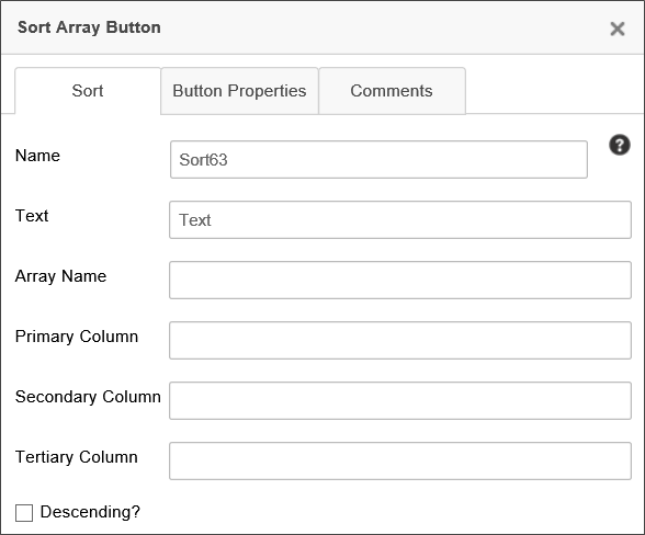
The Sort tab allows you to configure how the control sorts. You can define the text of the control button, its name, and the columns it uses as keys to sort the array. You can also have the control sort the array in descending order.
Properties
Name: The Control name for the control.
Text: The Text that will be displayed on the control's button at run-time.
Array Name: The Control name for the array you wish to sort, e.g., "Arraystart1".
Primary Column: The control name of the control you wish to use as the first column to sort, e.g., "LastName".
Secondary Column: The control name of the control you wish to use as the second column to sort, e.g., "FirstName".
Tertiary Column: The control name of the control you wish to use as the third column to sort, e.g., "City".
Button Properties Tab
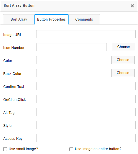
The Button Properties tab enables you to configure the button for the Sort Array control. You can provide the URL of an image to use for the button, and style it via CSS. Upon clicking the button, you can ask the user to confirm that he wants to sort the array. You can also specify a JavaScript function to be run when the user clicks on the button.
Properties
Image URL: The optional fully-qualified URL of a GIF, JPG, or PNG file to use as an image for the button, if any, instead of an icon.
Icon Number: This property will, when the Choose button is clicked, open the Icon Chooser, from which you can choose the icon, and its color, to display on the button, in lieu of the standard Sort icon that is displayed by default.
Color: This property will, when the Choose button is clicked, open the Choose Color dialog box to choose the text color of the button.
Back Color: This property will, when the Choose button is clicked, open the Choose Color dialog box to choose the background color of the button.
Confirm Text: The optional confirmation message you'd like to appear in a confirmation dialog when the button is clicked. Leaving this property blank won't display a confirmation dialog.
OnClientClick: The optional name of a JavaScript routine that is contained on the form, and which you'd like to run as client-side script when the button is clicked, e.g., "SortButtonClickHandler".
Alt Tag: The Alt Tag text for the button, for accessibility.
Style: Optional CSS style commands to format the button via CSS.
Access Key: The keystroke combination to set focus to the control, for accessibility.
Use Small Image?: This option, when checked, will reduce large images to a fixed size for use as an button icon, for images specified using the Image URL property.
Use Image as Entire Button?: This option, when checked, will, for images specified using the Image URL property, display the specified image as an image button. The image will not be resized when this setting is used.
Row Number
The Row Number control simply displays the row number (starting with row #1).
Array Value #
The Array Start control has a unique value that is always the number of rows in the Array. If an Array has three rows, the value of the Array Start control will be 3. Since the Name of the Array Start control is used as the name of the Array as whole, we would also say that the Array's value is 3. By default, the value of an Array is 0, which, as a practical matter, means that when the form is initially displayed, no rows will appear on the form. When configuring the Array Start control, therefore, it's best to set the Default Value of the control to 1, which will display a single empty row when the form is initially displayed. The empty row is a good visual cue for the user that some data needs to be entered.
While there are Array controls that enable you to manage and delete single rows from the Array, sometimes, you might want to clear all of the rows. While there's no Array-specific feature to do this, using a Set Form Data action is an effective method to reset an Array.
In order to invoke a Set Form Data action on an Array, you first need to place a Button control on the form, or tie the Set Form Data action to an appropriate event. As we discussed, an Array has a value that's equal to its number of rows. Setting that value to 0 deletes all of the Array rows. Subsequently setting it to 1 then creates a new, blank row to display on the form.
You'll need two Set Form Data actions, one to clear the Array (set the value to 0), and one to add a new blank row to it (set the value to 1). This pattern effectively resets the Array to its initial state. If we stopped at setting the value to 0, the Array would be empty and no rows would be displayed at all.
Array Data Entry Control Values #
When a data entry control is placed outside of an Array, it only stores a single value for each form instance. A field inside of an Array, however, works quite differently. Instead of storing a single value, the field stores a comma-separated list of values. For instance, a field inside an array that contains three rows might return the string "Value1,Value2,Value3" as the value of the array control. The value of a specific row in an array can also be retrieved as a single value through the use of the array row's index (ROW_NUM). Please see the Parameters topic of the system variables guide for more information on extracting an array row value using the ROW_NUM formatter.
The Form Controls tab of a Form definition will display the name of an array field by its field name, followed by the name of the Array that contains it in square brackets. For example, if the Form contains an Array named ItemsArray, all of the fields located inside the Array row are followed by the text [ItemsArray] to denote that the field is part of that Array, e.g.:
FieldName [ItemsArray]
Array Event Fields #
Any time you make a field an event field, the Form refreshes when the event fires. The refresh is required to invoke all of the actions tied to the event, such as recalculations for Calculation and Sum controls. But when the Form refreshes, it resets the Form's tab order back to the top of the form.
Tab order specifies what field will be automatically selected when the user hits the [TAB] key after entering data in the field. In Process Director, the tab order moves through all of the data entry controls from left to right, then top to bottom. When a user changes the value of an event field, pressing the [TAB] key doesn't set the focus to the next control in the normal tab order. Instead, focus gets set back to the top of the page, as if the page were being opened for the first time.
To override the tab order reset that occurs when an event fires, you must use the Set Focus Custom Task to set the focus to the correct field. On the Custom Task Event Mapping tab of the Form, add one instance of the Set Focus Custom Task for each event field in the Array. For each instance, select the event field as the triggering event and configure the Custom Task to set focus to the next field in the desired tab order. With this configuration, when the event fires and the form refreshes, the Set Focus Custom Task will move focus to the correct next field rather than returning to the top of the form.
Labels for Array Fields #
When you place data entry controls on a Form, you should always use a Label control that links to the data entry control for accessibility purposes. Arrays are a little different. Because Arrays are presented in a tabular format, normal Label controls don't work well for them. There are several technical reasons for this, but without going into a lot of boring technical detail, suffice it to say that Label controls are designed to work with a single specified data entry control, and not with multiple controls that all have the same name.
Array fields have a special control to provide the correct labeling for accessibility and responsiveness: the Array Column. The Array Column control is not available in the UI, and can only be placed on a Form using the ArrayColumn Control Tag.
Since Arrays are presented in a table, the first row of the table should contain the Array Column control. You can manually type the control tag syntax directly on the page, but BP Logix recommends that you use the System Variable control to encapsulate it. Each Array Column should reference the array field that appears in the same column. Process Director will automatically associate the Array Column with the fields below it. At run-time, the Array Column will provide the appropriate labeling for the data entry controls. In addition, at smaller screen widths, the Array Column controls will be refactored as labels for each control when the table is redrawn to fit smaller screens.
Array Data, Conditions, and Validation #
Set Form Data
In order to determine what values go into each row of the Array, each row has its own row context, which is to say that the set of values contained in the same Array row are all linked to that specific row. Each row in an Array has a specific row number assigned to it, which we call the row's index. The first row in an Array always has an index of 1, the second row has an index of 2, and so forth. The Row Number control is used to display the index of each row automatically. The index of a row is always fixed to the row's position in the Array, from top to bottom. If you move the second row in an Array up to the first row, its index will change to 1.
The index is quite important for array fields because it enables you to specify the value of a field in a specific row. The normal value of an Array field is a comma-separated list of values. But, using the index, you can specify the value contained in a specific row. Process Director enables you to do this in two ways. First, in the UI itself, Array fields are displayed with a Row Number text box that enables you to specify the index. For example, in the Set Form Data tab of a form definition, when referencing an array field, you'll see this text box displayed to the right of the field name, as shown below. You can enter the appropriate index number into this box, which will enable you to set the value of the field on that specific row. Leaving this box blank will change the value of every row to the value you specify. By default, this field is blank, and the field value will return all of the values in that array field as a comma-separated list.
You can specify a specific row to change by entering the row number in this text box, e.g.:
In the example above, the data would be set only in the second row of the array. Arrays rows are 1-based, which is to say that the first row of the array starts at the number 1.
Conditions
In the Condition Builder, using an array field will, by default, try to evaluate the entire contents of an array field, meaning the entire list of field values will be returned in a single string, as a comma-separated list. You can, however, evaluate a single array value by using a Form field System Variable the contains the ROW_NUM modifier, which returns the value from a specific row in the Array:
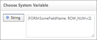
{FORM:SomeFieldName, ROW_NUM=2}
With this syntax, the System Variable will only return the value from the field in the second row of the array. In this case, you won't be able to select the Form Field menu item of the Choose System Variable dialog box to specify the field. Instead, you'll need to use the Value > String menu item and enter the System Variable manually. You can enter the System Variable as the string value and, at run-time, the system will use only the value from the specified row of the Array to use in the comparison.
There's also an alternative syntax to declaring the row number that's a little more convenient:
{FORM:SomeFieldName:2}
Indeed, you can use the existing syntax shortcut for Form field System Variables, omitting the FORM element:
{:SomeFieldName:2}
In this case, you won't be able to select the Form Field menu item of the Choose System Variable dialog box to specify the field. Instead, you'll need to use the Value > String menu item, and inter the System Variable on the left side of the condition.
You can enter the System Variable as the string value and, at run-time, the system will use only the value from the specified row of the array to use in the comparison. The condition row in the Condition Builder will then appear similar to the example below.

Arrays can, of course, have any number of rows, so, if you use a specific row number, be aware that the specified row may not actually exist in the array.
While not a data entry control itself, the Array Start control has a value that is automatically set to the number of rows contained in the Array. You can, therefore, always access the last row in an array using the Form Field System Variable of the Array Start control to call its value:
{FORM:SomeFieldName, ROW_NUM={:ArrayStart}}
{:SomeFieldName, ROW_NUM={:ArrayStart}}
{:SomeFieldName:{:ArrayStart}}
The Array Start control's System Variable always returns the number of rows in an array, and thus can always be used as a pointer to the last array row, irrespective of how many rows the array contains.
{FORM:SomeFieldName, ROW_NUM={NUM_ROWS}}
The {NUM_ROWS} system variable always returns the number of rows in an Array and thus can always be used as a pointer to the last Array row, irrespective of how many rows the Array contains.
Validation
Array fields can be used in validation conditions, but you should be aware that complex conditions may not return the results you expect, because Process Director will evaluate each element of a complex condition separately. For instance, let's say that you have two columns in an array that contain the following values.
| COLUMN 1 | COLUMN 2 |
|---|---|
| 3 | ABC |
| 1 | DEF |
If you set a complex condition, such as, Column 1 = "3" AND Column 2 = "DEF", the condition will return "True", even though the values you're looking for don't exist in the same row.
Similarly, validation filter conditions that use Array fields on a Form can be complex, and may not work in the way you expect, because various filter conditions operate differently depending on whether you are trying to filter based on a single (scalar) value or an Array (column) value, and whether the value is used on the left or right side of the operator in the Condition Builder. As you can see, using Array fields in conditions can be quite complex, so you need to consider their use very carefully.
A more comprehensive look at array conditions is presented in the Using Arrays in Conditions section of the Condition Builder topic.
Row numbers for an array row can also be accessed via the Row Number System Variable.
Other Control Tools
You can view the documentation for all tools available in the Online Form Designer by using the Table of Contents on the upper right corner of the page, or by clicking one of the links below.
Basic Controls: The most commonly-used form design tools.
Input Controls: Controls that are commonly used to collect data, but are a bit less widely used than the basic controls.
Other Input Controls: Additional Input controls, consisting mainly of the different content picker controls.
Actions: These controls enable you to control form actions, like placing buttons, or choosing objects via a picker,
Other Controls: Controls that perform miscellaneous tasks like adding HTML content, or labels.
Layout: Controls that are used to govern the control layout for the template, such as tabs and sections.
Responsive Layout: Controls that implement Bootstrap form layout objects.
Attachments: Controls that enable you to add and show attachments, such as documents or images, to the Form.
Data List (v6.0.100 and higher): Controls that enable the display of tabular data on a Form.
Form Control Tags: System Variables used to add controls to a Form, instead of using the UI controls.
Documentation Feedback and Questions
If you notice some way that this document can be improved, we're happy to hear your suggestions. Similarly, if you can't find an answer you're looking for, ask it via feedback. Simply click on the button below to provide us with your feedback or ask a question. Please remember, though, that not every issue can be addressed through documentation. So, if you have a specific technical issue with Process Director, please open a support ticket.


